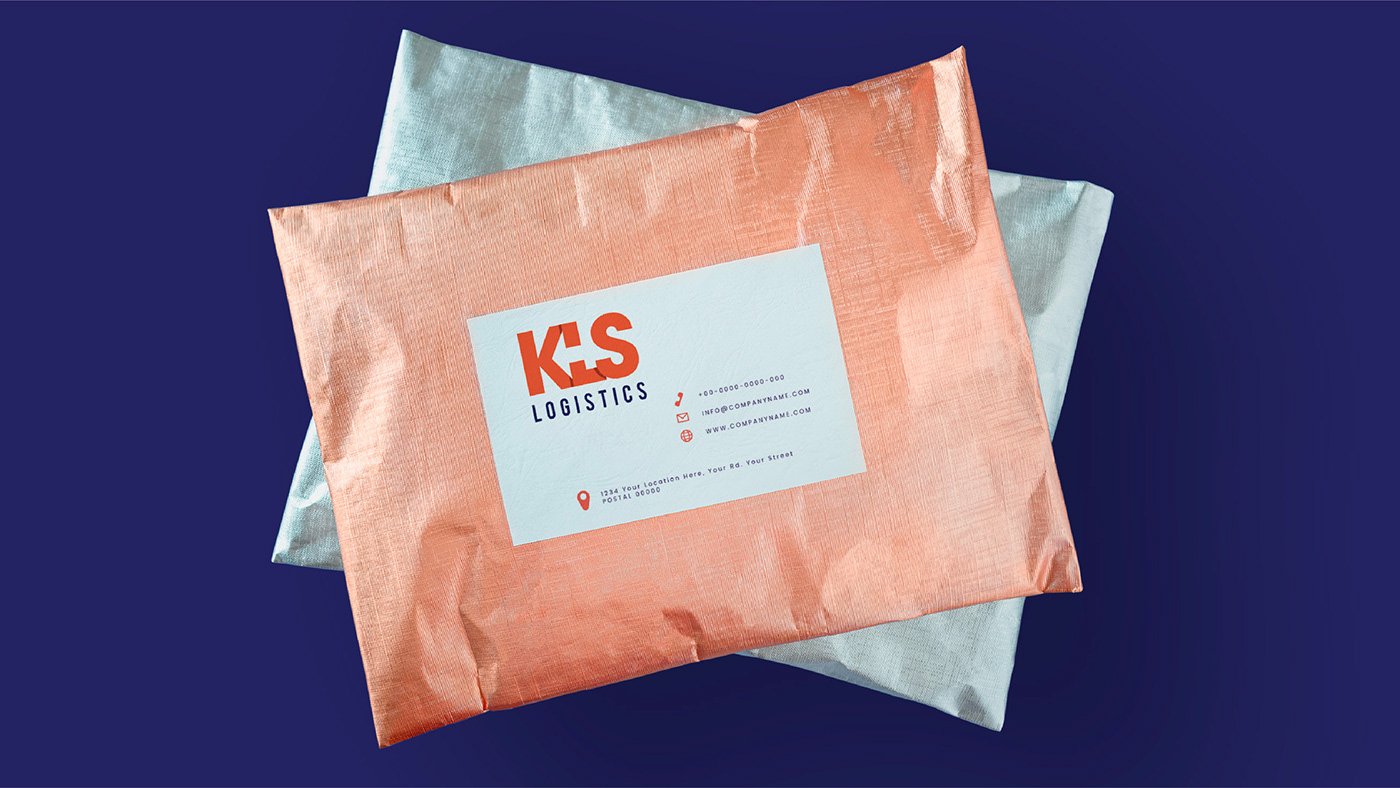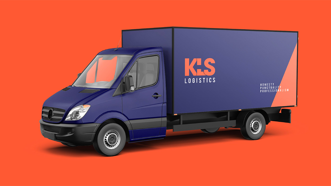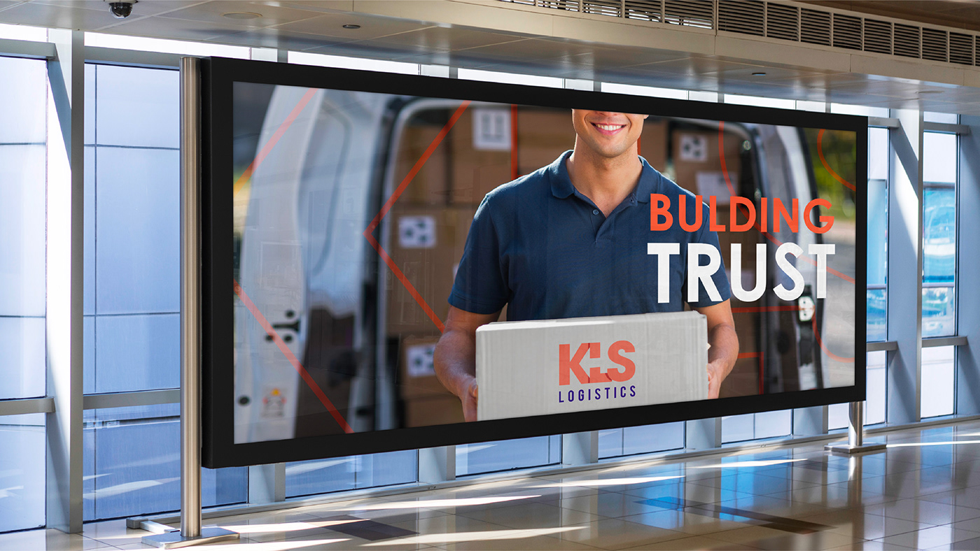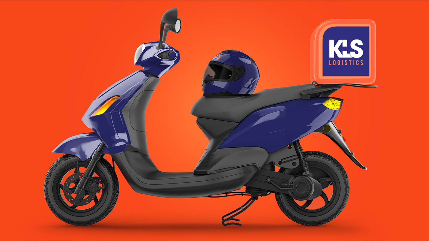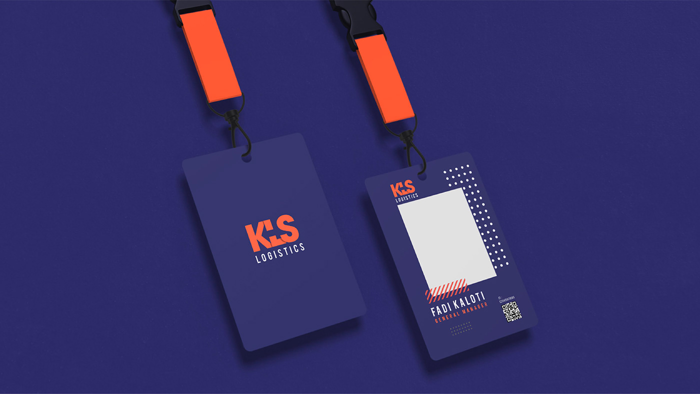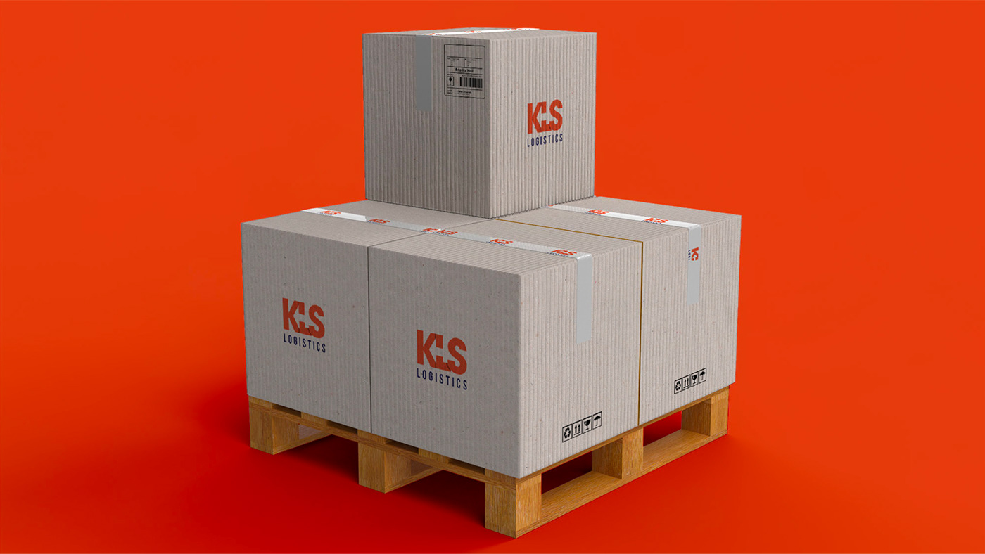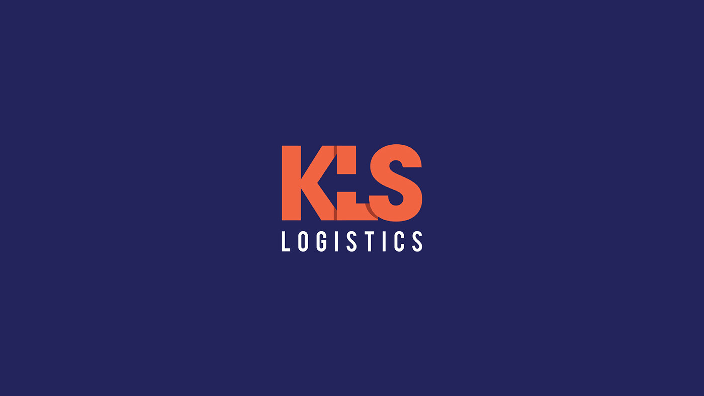
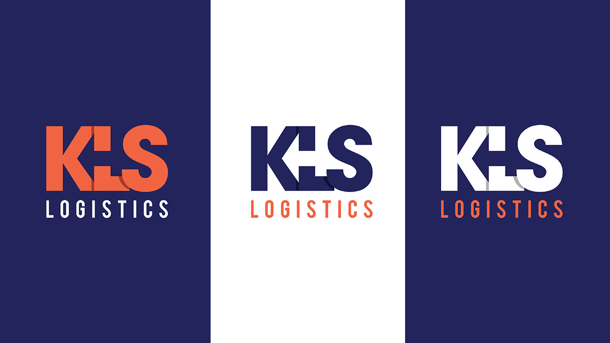
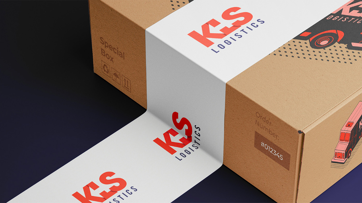
KLS Logistics a leading supplier in the logistics industry, sought to redefine its brand identity to reflect its commitment to innovation, efficiency, and reliability. As a trusted partner for companies like UPS, KLS aimed to modernize its image and position itself as a dynamic player in the logistics sector.
The logo for Bionic is a visual representation of its forward-thinking approach and commitment to modernity. The utilization of blue as the primary color evokes trust, professionalism, and stability, aligning seamlessly with the healthcare industry's values. The distinct feature of the logo is the letter "B," crafted from three separate shapes. This minimalist and modern design approach symbolizes versatility, adaptability, and dynamism, reflecting Bionic's innovative spirit and ability to meet the diverse needs of its clients in a rapidly evolving industry landscape.
Branding Strategy:
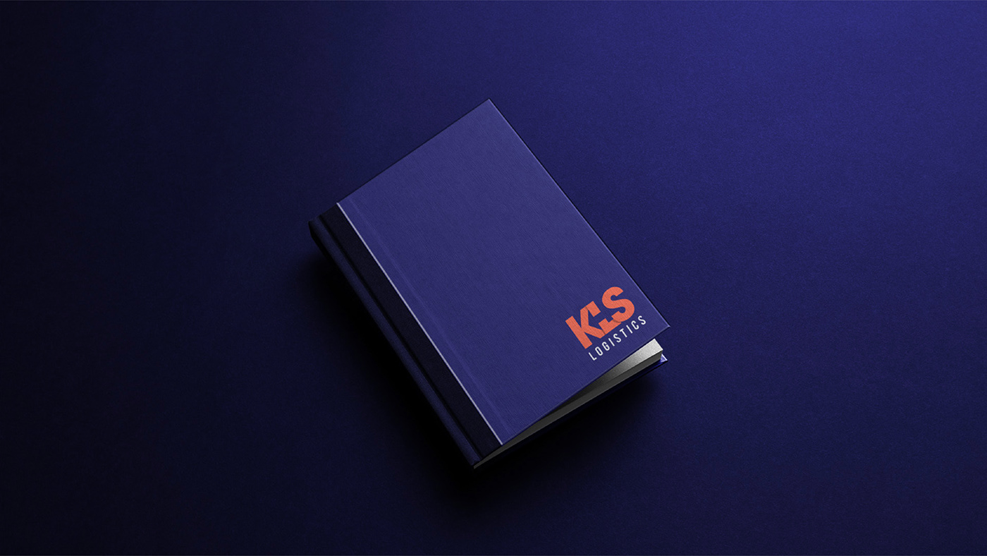
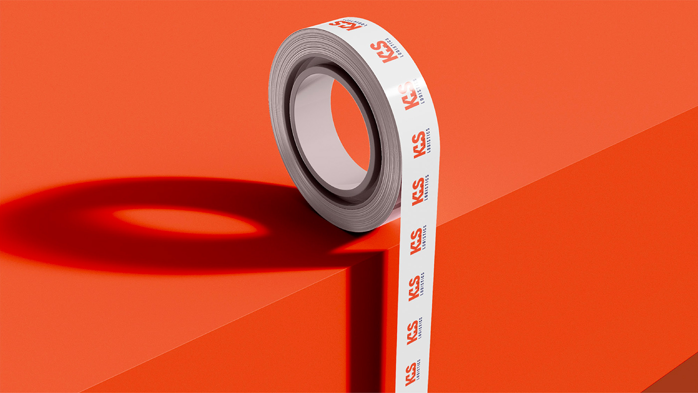
The branding strategy for KLS Logistics revolves around highlighting the company's core values of reliability, efficiency, and innovation. Through consistent visual elements and messaging, the brand aims to position itself as a trusted partner in the logistics industry, capable of delivering tailored solutions to meet the evolving needs of its clients.
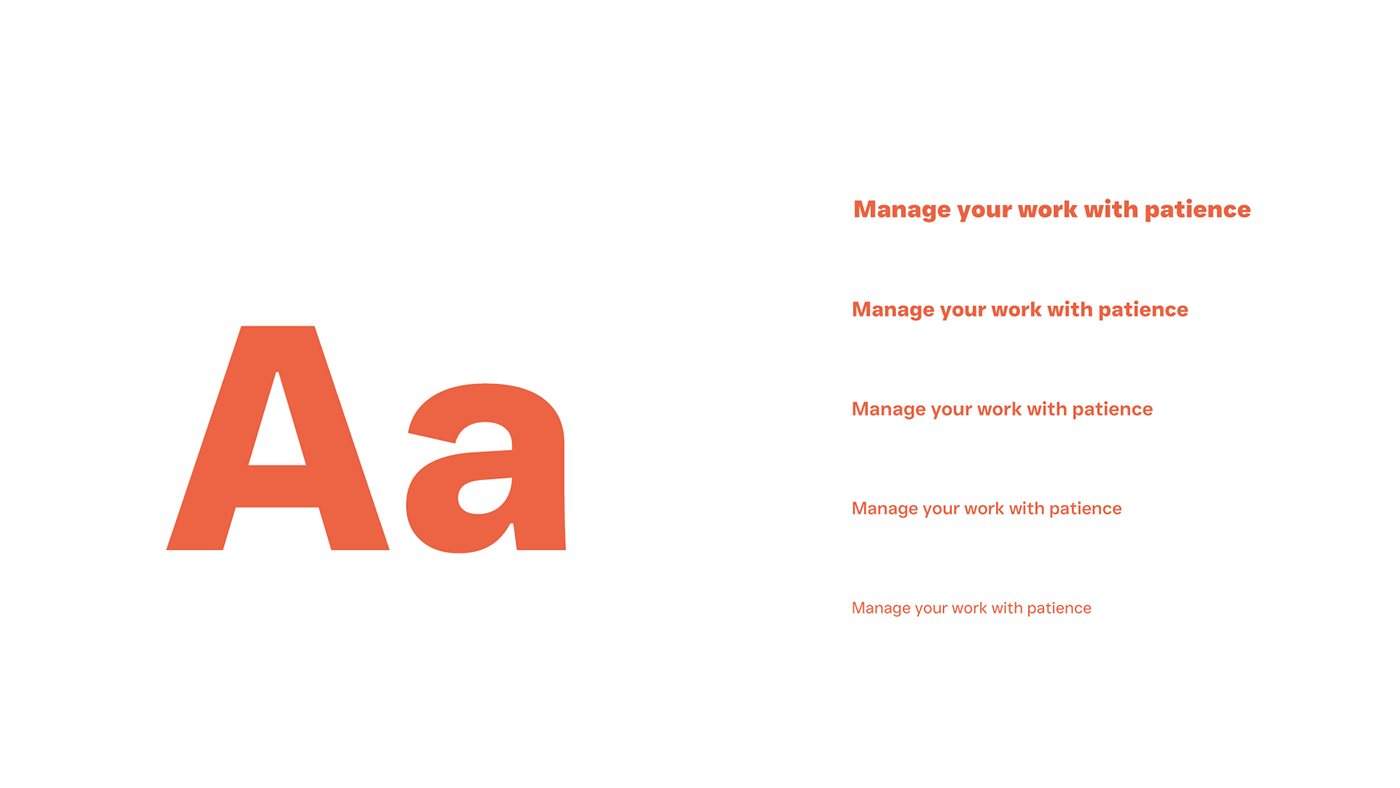
Clean and modern typography was selected to complement the logo, ensuring readability across various communication channels. Consistent typefaces reinforce brand